Modern UI? Check.
Hero section polished? Check.
Benefit-driven copy? Check.
Visible CTAs? Check.
Everything looks perfect, and yet the same question keeps coming up: “Why is the website not converting?”
A study by Ruler Analytics shows that the average website conversion rate across industries is only 2.9%.
The reason is simple.
Most brands focus on how the site looks. The UI is polished, the layouts are trendy, and the visuals feel professional. A good UI is important because first impressions matter, and it sets the stage for engagement. But what businesses often overlook is how the site behaves, guides, reassures, and responds.
The user experience (UX) is what actually drives website conversions. Without it, even a beautiful website rarely converts as well as it should.
Seeing your conversions stuck, you might have tried running more paid ads, tweaking copy, or improving SEO to drive more traffic. But the real issues often remain hidden.
After working with businesses across industries on UI/UX, we have seen the same patterns time and again. In this blog, we’ll discuss the six UX issues most likely holding your website back, how to fix each one, and a case study of a website that nails UX and converts effectively.
Table of Contents
Top 6 UX Problems That Keep Your Website From Converting
Even the most visually stunning websites can underperform if the user experience is off. In fact, conversion rates across digital channels have dropped by 6.1% this year (Contentsquare 2025 Digital Experience Benchmarks Report). To recover from this decline, creating an engaging, personalized user experience makes all the difference.
After analyzing website performance across industries, we’ve pinpointed six core UX issues that consistently hold back conversions.
Below, we break down each problem, show why it impacts your results, and share how to fix it.
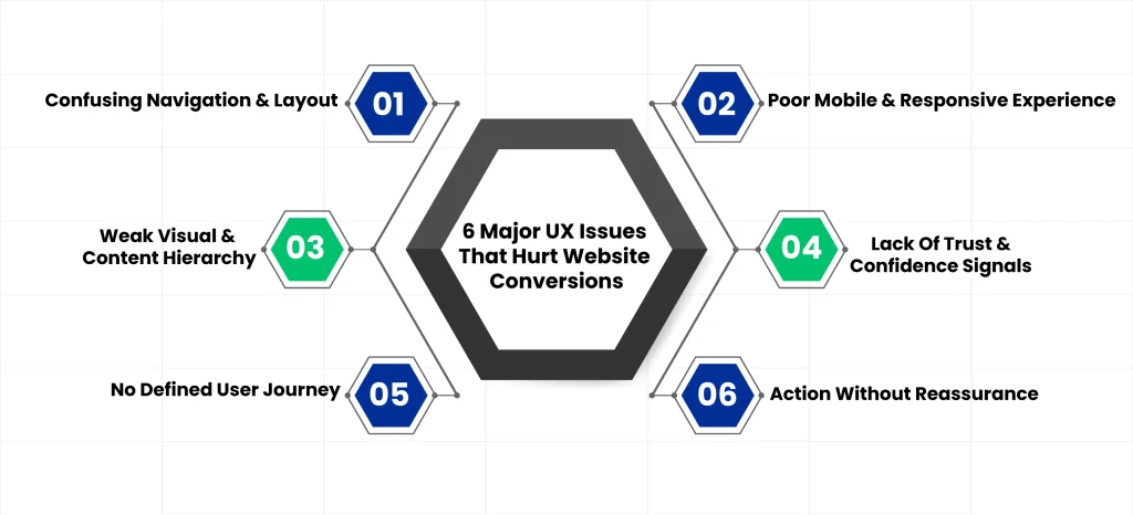
Problem #1: Confusing Navigation & Layout
Visitors need to understand immediately where to go and what to do next. When navigation is cluttered, menus are inconsistent, or pages compete for attention, users hesitate and get frustrated. Even if your website looks good, unclear paths make it difficult for users to complete actions, lowering overall conversions.
Why It Hurts Conversions
- Users feel lost and abandon pages
- High-intent visitors leave without engaging
- Bounce rates increase on key landing pages
How To Fix
- Focus each page on one primary action
- Build navigation around user goals instead of internal structure
- Create a clear progression through the conversion funnel
Problem #2: Poor Mobile & Responsive Experience
Many websites are designed for desktop first, then squeezed onto mobile screens. Small tap targets, awkward scrolling, and collapsed content hierarchy frustrate users. Your highest-intent visitors struggle the most when the experience does not match how they actually interact with the site.
According to Google’s Data, 53% of mobile users abandon a website if it takes more than 3 seconds to load.
Why It Hurts Conversions
- Mobile users abandon tasks when they encounter friction
- Decision points like forms or checkout become harder to complete
- Pages lose engagement, and bounce rates increase
How To Fix
- Make mobile-first UX decisions from the start
- Use thumb-friendly navigation and tap targets
- Prioritize content instead of compressing layouts
- Optimize for Core Web Vitals: Aim for LCP ≤ 2.5 sec
Problem #3: Weak Visual & Content Hierarchy
Strong content and visual hierarchy are considered some of the latest trends in UI/UX design. But in reality, they’ve always been fundamental.
Unbalanced layouts and disorganized content structures can make it harder for the user to spot critical information.
Nielsen Norman Group research shows that, on average, a user will only read 20% of the content on your web page.
As users scan a page, the hierarchy must be strong enough to guide attention and decisions. That’s the reason why we use techniques like contrast principles, grid systems, usability testing, and card sorting in our UI/UX designs to guide users and reduce frustration.
Why It Hurts Conversions
- If the next step isn’t obvious, users hesitate, lose momentum, and leave without taking action.
How To Fix
- Establish a clear decision hierarchy on every page
- Use visual weight to signal importance
- Present one obvious next step with supporting context
Problem #4: Lack Of Trust & Confidence Signals
A polished interface cannot replace credibility. Generic messaging, vague claims, and missing proof leave visitors uncertain. Design looks good, but reassurance is missing when it matters most.
Why It Hurts Conversions
- Users hesitate before committing to an action
- Trust gaps appear at key decision points
How To Fix
- Embed proof near primary actions
- Replace slogans with specific details
- Use UX patterns that reduce perceived risk
Problem #5: No Defined User Journey
Visitors are treated as if they are all the same. Pages are identical for every user, intent is ignored, and decision-stage needs are overlooked. Everyone gets the same generic experience.
Nothing hurts conversions more than a complex user journey. Optimizing flows and eliminating friction through thoughtful interaction design is a vital part of our UI/UX design services at Clustox.
Why It Hurts Conversions
- Content does not match the user’s mindset
- Users do not feel understood
- High-quality traffic disengages
How To Fix
- Map UX flows to user intent
- Design pages for each stage of the journey, not just topics
- Guide visitors toward confidence and clear next steps
Problem #6: Action Without Reassurance
Users click, then hesitate or abandon because they receive no feedback. Forms feel risky, and interactions provide no clear explanation of what happens next.
You need a stunning UI backed by conversion-centered design strategies, like AI-powered UX analytics and A/B testing.
Why It Hurts Conversions
- Anxiety spikes after clicking
- Users abandon mid-commitment
How To Fix
- Provide clear feedback statements for all interactions
- Use reassuring microcopy during actions
- Confirm explicit next steps so users know what to expect
See How Clustox Turns UX Friction Into Conversions
- Cognitive UX Design: UX heuristics & decision modeling to reduce uncertainty at critical decision points.
- AI-Powered UX Audits: Behavioral data & usability signals to pinpoint the highest-impact conversion blockers.
- Journey-Based UX Mapping: Pages and flows designed by intent stage, not generic layouts.
Get an Expert UX Audit
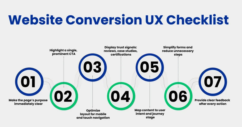
What to Fix First (If You Want Conversions to Improve)?
Now that you’ve seen the six UX problems, it’s normal to wonder where to start. You don’t fix everything at once. Start with uncertainty hotspots. Here, top UX tools can help reveal where first-time visitors struggle the most.
To help, ask yourself these questions for every page on your site.
1. Can a First-Time Visitor Answer These in 5 Seconds?
Who is this for, what problem does it solve, and what should they do next? If any of these are unclear, visitors leave before even engaging. Clear answers here set the stage for every other CRO improvement.
2. Does Every Page Have One Dominant Action?
Each page should have a single primary call-to-action (CTA), with any supporting actions visually secondary. When visitors face multiple competing messages, even high-intent users get stuck, and your website’s conversion rates stay low.
3. Does the Mobile Experience Remove Effort, Not Compress Content?
Your website should let users complete key actions without zooming or hunting for information. Forms must work smoothly, and important content should always be visible. Mobile-first design ensures high-intent visitors aren’t lost to frustration.
4. Is Trust Visible at the Moment of Action?
Proof matters at the exact moment someone is about to click. Trust signals, such as client logos, results, or case studies, should be near your CTAs. If trust comes too late, hesitation wins, and visitors leave before converting.
5. Is the User Journey Intentional or Generic?
Every visitor has a different intent and stage in the decision process. Map your user journey to match that intent, guiding visitors from curiosity to confidence. If everyone sees the same generic pages, even qualified users disengage.
6. After Someone Clicks, Is Uncertainty Reduced?
Interactions and form submissions should reassure the visitor immediately. Clear feedback, error explanations, and explicit next steps prevent anxiety and keep high-intent users moving through your conversion funnel.
Real-World Example: Airbnb
We have chosen Airbnb to show how their website drives conversions through thoughtful UX. For context, Airbnb is a global platform that helps travelers find and book unique stays. Their site demonstrates that high conversions come from guiding, reassuring, and simplifying the user experience, not just beautiful visuals.
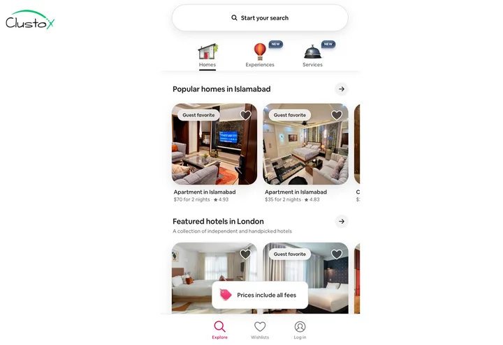
Homepage Clarity
The homepage immediately communicates purpose. A prominent three-field search bar with high-quality destination imagery tells travelers exactly what to do next.
Scannable Search Results
Search results are clean and scannable. Cards display price, rating, “Superhost” tags, and short descriptions without overwhelming users.
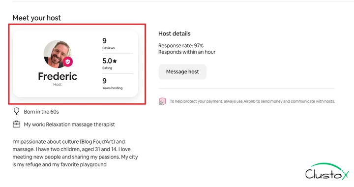
Building Trust on Listing Pages
Listing pages builds trust. Host profiles, reviews, ratings, and security badges make commitment feel safe.
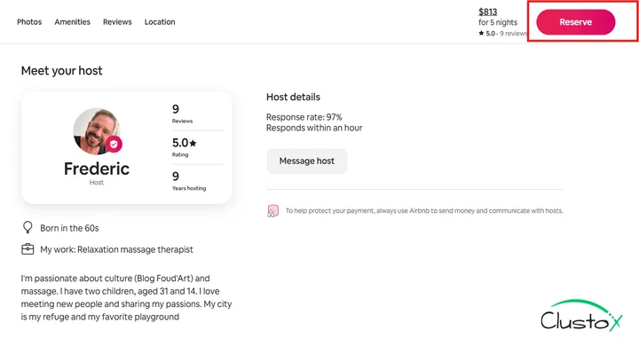
Clear and Contextual CTAs
CTAs are clear, contextual, and large. “Search” on the homepage, “Reserve” on listings, and “List Your Space” for hosts. All are high-contrast and mobile-friendly.
Seamless Mobile Experience
Mobile experience is smooth. The layout is responsive, load times are fast, the search bar is sticky, cards are swipeable, and tap targets are thumb-friendly.
Guided User Journey
The user journey flows naturally from search to listing to booking, with reassuring microcopy and clear pricing at every step.
Wrapping Up
Most conversion issues don’t come from traffic or intent. They come from friction. When website UX design doesn’t help people understand where they are or what to do next, hesitation creeps in. Across navigation, hierarchy, mobile usability, and trust, the same thing keeps showing up. Small moments of confusion quietly undo the effort already put into the product and marketing.
Sometimes small fixes aren’t enough, which is where professional UI/UX design services can help map user journeys and remove hesitation points.
Fixing this goes beyond surface-level changes. It takes clear thinking across web design, web development, and mobile app usability, with real attention to how people move, pause, and decide. That’s the lens Clustox works from as a focused UX agency, designing experiences that feel obvious, reassuring, and easy to move through, so users don’t have to think twice before taking the next step.
Frequently Asked Questions (FAQs)
2. What’s The Difference Between UI Design And UX Design?
UI design focuses on visual presentation. Whereas UX design focuses on how users understand, move, and decide. A site can look polished but still fail to guide users. That’s the reason why visual quality alone rarely leads to consistent website conversion. This distinction helps teams prioritize usability improvements over purely aesthetic changes.
3. Do UX Changes Affect SEO Or Paid Campaign Performance?
Yes. When UX issues are fixed, visitors spend more time on the site, follow clearer paths, and complete actions more often. This makes traffic from SEO and paid ads more effective, as clicks turn into real results rather than stalled sessions. Better UX can also reduce bounce rates, which, over time, indirectly supports search engine rankings.
4. How Do UX Design Firms Measure Success Beyond Visuals?
UX design firms track outcomes tied to behavior, such as task completion, form submissions, and drop-offs at decision points. Success is measured by clarity and movement, not just if a page looks modern or on-trend. Heatmaps, session recordings, and A/B testing provide deeper insights into these behavioral metrics.
5. How Quickly Will UX Improvements Impact Website Conversions?
Results vary depending on the severity of issues and traffic volume. Some fixes, such as clarifying a call to action or reducing form friction, can improve conversions almost immediately. Others, like restructuring a user journey or redesigning mobile flows, may take a few weeks to reflect measurable gains in user behavior.
Stop UX Friction from Hurting Conversions