In the competitive landscape of app development, how often do you pause to consider the first impression your app makes?
Studies indicate that 75% of users judge an app’s credibility based on its icon alone. A well-designed AI application icon not only captures attention but also communicates your app’s purpose and value proposition instantly.
However, designing icons that are both visually appealing and platform-ready can be challenging. Traditional design methods require time, precision, and multiple iterations, which can slow down product teams and limit creativity.
This is where the Stable Diffusion AI app becomes a game-changer. By using a stable diffusion icon workflow, teams can generate high-quality, customized app icons from simple prompts or reference images. This allows exploring multiple styles and concepts quickly, saving time while maintaining professional quality.
In this blog, we will discuss how to use Stable Diffusion AI to generate app icons for IOS and Android, create polished visuals, and elevate your brand.
So, let’s get started!
Stable Diffusion for App Icon Creation: What You Need to Know?
Stable Diffusion has become one of the most versatile AI tools for designing high-quality, customized AI app icons. Rather than relying solely on stock icon packs or traditional design software, it empowers designers to generate app store icons from text prompts, style references, or even uploaded sketches.
As a result, you can quickly explore a wide range of design directions, from color schemes and shapes to overall themes, in minutes instead of hours.
Table of Contents
To get the most from Stable Diffusion for app icon creation, it’s important to understand a few aspects. First, identify which model or checkpoint is best suited for icon design, since different models produce different styles and levels of detail.
Next, craft clear and specific prompts to guide the AI toward your desired look, and use fine-tuning options to adapt outputs for various platforms such as iOS, Android, or the web.
Finally, keep licensing in mind if you’re using third-party models to ensure your icons are safe for commercial use. Following these instructions, you can create a simpler workflow that delivers professional-looking app icons at scale with far less effort than traditional methods.
Want premium icons without endless revisions? Our team helps you turn Stable Diffusion outputs into store-ready visuals your users trust.
Which Essential Tools and Models are used for Generating App Icons?
Stable Diffusion alone is powerful, but pairing it with the right tools and specialized models makes app icon creation faster and more consistent. These resources give you control over style, resolution, and final polish.
To make it easier, let’s break it into two parts: tools you’ll use to run Stable Diffusion and models you’ll load for icon-specific results.
Well, let’s examine it!
Tools
- DiffusionBee: Simple macOS app with built-in models and presets for quick generation.
- Automatic1111 Web UI: Advanced Windows/Linux interface with extensions and flexible prompt control.
- InvokeAI: Browser-based UI offering quick previews and simplified workflows.
- ControlNet Add-ons: Plug-ins that let you guide layout, shapes, or structure precisely.
- Vector Editors (Figma/Illustrator): For polishing, recoloring, and exporting icons.
- Upscalers/Background Removers: To sharpen images and prepare clean and transparent backgrounds.
Models
- Icon-Diffusion Models on CivitAI: Pre-trained for flat, glyph, or 3D icon styles.
- Material Design Icon Models: Trained to mimic Google’s Material aesthetic.
- Minimalist Icon Style Models: For crisp, simple icons that scale well.
- Skeuomorphic Icon Models: For detailed, realistic-style app icons.
- Custom LoRAs (Low-Rank Adaptation): Small add-on weights you can train yourself to match your brand’s style.
Using these tools with the right models allows you to generate unique, brand-consistent app icons. Start in a Stable Diffusion UI, pick a model that matches your style, guide output with ControlNet if needed, then finish your icons in a vector editor for platform-compliant results that look professional on both iOS and Android.
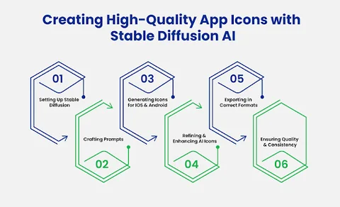
What Are the Steps to Create High-Quality App Icons with Stable Diffusion AI?
Product teams can use Stable Diffusion AI to design and deliver high-quality app icons quickly. This guide explains how to set up the tools, write effective prompts, generate icons for iOS and Android, refine them for clarity, and export them in the right formats. Each step focuses on helping you move from concept to store-ready icons with minimal effort.
The following steps walk you through the entire process, showing exactly what to do at each stage to create professional app icons with Stable Diffusion AI.
Step 1: Setting Up Stable Diffusion for Icon Design
Before generating any icons, you need to prepare the right environment. A proper setup ensures Stable Diffusion runs smoothly and produces images at the quality you need for app stores. Think of this stage as laying the foundation for the rest of your design process.
To get started, focus on these essentials:
- Choose and install a Stable Diffusion interface: DiffusionBee for macOS offers an easy start, while Automatic1111 or InvokeAI work well on Windows and Linux.
- Download an icon-specific model or checkpoint from CivitAI or Hugging Face so your outputs match app-icon styles rather than generic art.
- Configure resolution and canvas size: 1024×1024 px is a good baseline for iOS and Android store requirements.
- Update your software and drivers to keep performance stable and avoid compatibility issues.
In order to make every subsequent step run more quickly and produce crisper, more consistent icons, you must first finish this setup.
Step 2: Crafting Prompts to Generate App Icons
Once your setup is ready, the next step is to tell Stable Diffusion exactly what you want. Well-crafted prompts guide the AI to produce icons that reflect your brand and comply with app store standards.
A strong prompt should describe the subject, style, colors, and level of detail you expect. You can also use negative prompts to exclude unwanted elements like text, extra objects, or complex backgrounds.
For example, if you’re designing a weather app icon, a vague prompt like “weather icon” won’t give you precise results. A stronger prompt would be:
"Minimalist flat-style weather app icon showing a white cloud and yellow sun on a blue background, high contrast, centered, no text, no extra details."
This level of detail ensures a clean, recognizable output that scales well on different devices. You can quickly generate multiple variations by adjusting colors, shapes, or style keywords. Compare the outputs and select the one that best represents your app.
Pro tip: Start with broader prompts to explore options, then refine them with specific style or color tweaks to get the perfect icon.
Step 3: Generating App Icons for iOS and Android
With your prompts ready, you can now begin generating icons that meet platform requirements. Open your Stable Diffusion interface and load the prompt you’ve created. To ensure that the output size meets common standards, choose the icon-specific model or checkpoint that you previously downloaded.
For example, 1024 x 1024 pixels is a dependable base size because both iOS and Android can reduce it without losing detail.
Next, run the model to produce several variations at once. Stable Diffusion lets you generate multiple images per prompt, so take advantage of this to explore different color combinations, layouts, or minor stylistic changes. Review each result inside the UI and flag the ones that most closely fit your brand guidelines.
Generating icons with these requirements ensures they will work well in a complete app, and using Mobile App Development services helps understand how icons integrate into full app designs. As you work, keep platform differences in mind.
For example, iOS icons often look best with rounded corners and a simple, bold palette, while Android icons can include slightly more detail but still need a clear silhouette. You will have a strong collection of AI-generated icons that are prepared for further development if you generate with these specifications in mind and save the best variations.
Step 4: Refining and Improving AI-Generated App Icons
After generating your initial icons, the next step is to refine them to ensure they look polished, professional, and consistent with your brand. AI outputs can sometimes include minor artifacts, uneven colors, or details that don’t scale well, so taking the time to enhance each icon is crucial before exporting.
Start by selecting the strongest variations from your generated batch. Open them in a vector or image editor such as Figma, Illustrator, or Photoshop to make adjustments. Focus on clarity, balance, and simplicity, because app icons are displayed at small sizes and must remain recognizable.
Optimization tips for AI-generated icons include:
- Clean up edges and shapes to ensure smooth lines and a crisp silhouette.
- Adjust colors and contrast to match your brand palette and maintain visibility at smaller sizes.
- Simplify complex elements that may look cluttered when scaled down.
- Add subtle shadows or highlights to give depth without overcomplicating the design.
- Test icons at multiple resolutions to ensure they remain sharp and recognizable on different devices.
- Align elements consistently for visual harmony and symmetry.
Your AI-generated icons will look professional and be prepared for the last export step if you follow these instructions and implement these improvements.
Step 5: Exporting App Icons in Correct Formats (PNG, SVG, Vector)
Once your icons are refined, the next step is to export them in formats suitable for different platforms. Choosing the right file type ensures your app icons display sharply on iOS, Android, and web interfaces.
PNG is the most common format for raster icons, providing high-quality transparency and color fidelity. SVG or vector formats are ideal if you need scalable icons for different sizes or responsive designs.
Before exporting, double-check the resolution. For most app stores, a 1024×1024 px file works well as the base, and you can scale it down to smaller sizes without losing quality. Keep your layers organized in your editor so that future edits are easy.
Additionally, consider exporting multiple versions with variations in background or color if your app appears in different themes or modes. You can make sure your AI-generated icons are prepared to blend in with your app and remain clear on all devices by carefully exporting them in the appropriate formats.
Step 6: Ensuring Quality and Consistency Across Devices
After exporting your icons, the final step is to make sure they look sharp, consistent, and professional across all devices and screen sizes. App icons often appear in different resolutions, on various backgrounds, and alongside other apps, so maintaining quality and brand consistency is essential.
To ensure high-quality and consistent icons, follow these tips:
- Test on multiple devices and resolutions to check clarity and legibility.
- Compare icons across iOS and Android platforms to ensure the design scales well in different environments.
- Check alignment and spacing to maintain visual balance in every icon.
- Review color accuracy so your brand palette remains consistent under different display settings.
- Ensure consistency across all app icons in a set if you are designing multiple icons for related apps or features.
- Iterate based on feedback from team members or users to catch any issues that might be overlooked.
You can ensure that your AI-generated designs stay polished and consistent wherever they appear by carefully going over and modifying your icons at this point.
Frequently Asked Questions (FAQs)
2. Do You Need Design Experience to Use Stable Diffusion for App Icons?
Not necessarily! Stable Diffusion AI allows you to generate professional-looking icons from text prompts, so even if you’re not a designer, you can experiment with colors, shapes, and styles. However, understanding basic design principles like simplicity, contrast, and clarity will help you create icons that scale well and stay recognizable on small screens.
3. Can You Use AI-generated Icons in Commercial Apps?
Yes, but you need to ensure the models or checkpoints you use are licensed for commercial use. Always check the licensing terms, especially if you’re using third-party models or LoRAs. By doing this, you can safely integrate AI-generated icons into your apps without worrying about legal issues.
Final Takeaway: Turning AI-Powered App Icon Design into Actionable Product Solutions
Creating high-quality AI app icons no longer has to feel overwhelming. Stable Diffusion AI allows teams to explore multiple design directions and integrate these improvements seamlessly into a comprehensive design solution.
Further, refining AI-generated icons ensures clarity, scalability, and a polished appearance across all devices. Teams enhance color, layout, and style to meet platform requirements and audience expectations. This approach transforms initial design challenges into actionable, reliable solutions for your app’s interface.
In addition to this, strong app icons strengthen overall product experience and reinforce brand identity. Combining AI app icon generator techniques with expert product development accelerates time-to-market and improves usability. Organizations achieve sustainable innovation while ensuring every visual element aligns with the larger digital strategy.
Cut design cycles in half and launch faster with AI-powered app icons that meet iOS and Android standards.